As a B&B, guesthouse or hotel it’s only natural to wonder how you compare to your competition in the hospitality industry. If you’re the owner of a small town B&B, you may be curious about how well the big city hotels are doing. You may own a cosy seaside guesthouse and wonder from time to time whether your neighbouring hotel rival has the same weekend vs weekday occupancy rates. Well, wonder no more, as we have put together a simple infographic that shows you just how well the hospitality industry has been doing in recent years via data provided by Visit England. Looking at the data between 2012 to 2015 we can clearly see the increasing fortunes of hotels, guesthouses and B&B, which is fantastic news!
So, what did we learn?
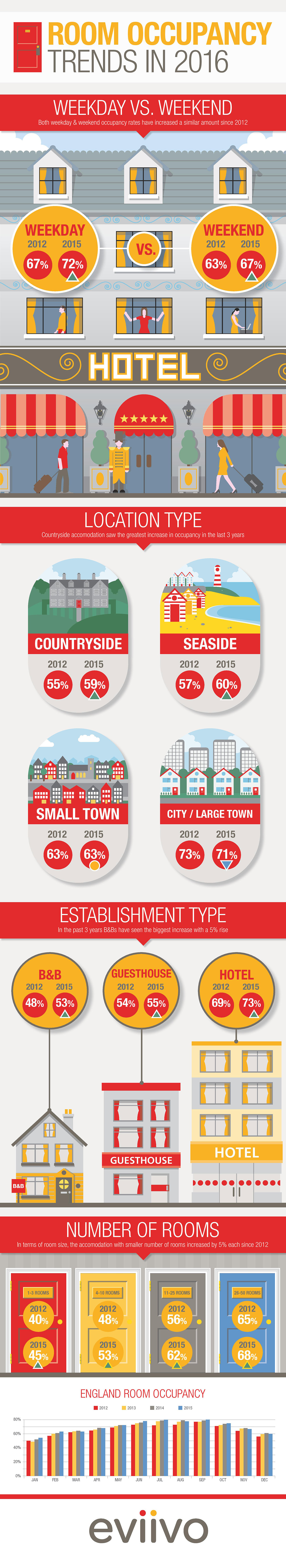
Weekend vs Weekday occupancy: Simply put, they’ve both done well. With both weekday and weekend rates having jumped up by similar degrees – Weeks increasing by 67% to 72% and weekends jumping from 63% to 67%.
Location, location, location: We were shocked to learn that occupancy rates in cities and large towns have actually declined a little since 2012, from 73% to 71%. But if you run such an establishment or are looking to do so, don’t fret, as providers in this category are still well ahead of their countryside (59%), seaside (60%) and small town (63%) counterparts as of 2015.
Are hotels still leading the way? While hotels did record the highest occupancy rates compared to guesthouses and B&B’s, it was heartening to see that B&B’s did have the biggest percentage increase – rising by 5%.
Occupancy rates: We were also interested in the occupancy stats when properties were divided into categories related to their number of rooms. There was an increase in occupancy rate across the board since 2012, with the smallest jump – 3% – being seen among properties with 26-50 rooms. However, those running the most modestly-sized establishments will be especially encouraged, given that the average rate in 1-3 roomed properties rose from 40% to 45% in just three years. Meanwhile, providers with 11-25 rooms saw an even bigger average percentage increase, from 56% to 62%.
That’s not all: The above doesn’t cover absolutely everything in our infographic, as we have also provided a graph showing room occupancy trends across the calendar years in the UK. While it’s hardly surprising that the warmer months of the year consistently record the highest average occupancy rates, reaching 80% in some cases, it’s nonetheless great to see the general upward curve since 2012, pretty much irrespective of season.
Below you will find the full report of our findings:
This data was provided by Visit England : https://www.visitengland.com/sites/default/files/downloads/december_2015_eos_newsletter.pdf
Wherever you are located or whatever type of accommodation you run; If you are looking to increase occupancy, eviivo can help! Our eviivo suite connects you to all the biggest travel websites, allowing you to take bookings and manage them all in one place
If you are already an eviivo suite customer and are looking for more help to boost the bookings, our personal expert service can give you a tailored report on your property and offer you invaluable advice about how to maximise your revenue and occupancy.